V1 Group 4 2011
Welcome to Group 4's offical blog - all the work of Nikki-Leigh, Kiera, Ruben & Billy :)
Thursday, 5 May 2011
Tuesday, 3 May 2011
Picture of us all using Final Cut Pro in the media suite, a program which became extremeley useful indeed!
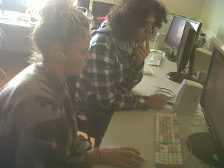
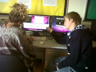
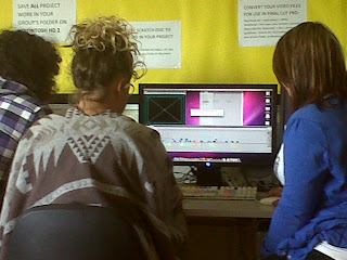
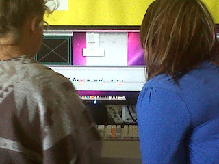
Final Cut Pro was obviously the most useful programme of all. We all had a good go at using it and despite early confusion we became good at it.
As a group, when we filmed we literally went to the wood and continued the filming in the hospital. We shot our scenes, with a variety of camerashots and angles in mind but were not certain. We wanted to create certain effects in most cases, without little knowledge of Final Cut Pro ,we often thought "oh we will edit it later". Nevertheless, it has to be said we got a bit lucky, in that Final Cut Pro was unbeleivably good, it has everything we needed, and there was nothing we couldnt do, we relied on it and it delivered, so did we, which we were all very pleased about.
7. Looking back at the preliminary task, what do you think you have learnt from the progression from it to the full task?
From our preliminary task we learnt the 180-degree rule where the camera has to stay on the same side throughout the whole of the duration of shots. We discovered that if we broke this rule the positioning of the shot becomes uneven and doesn’t connect with the previous shot. For example in our first shooting of our preliminary we broke the 180-degree rule when filming Kiera and Ruben talking. We shot Kiera from one side of the bench and Ruben f rom the other which made the sequence look unproffesional and messy. Therefore in our actual project we were always aware of keeping loyal to the rule in order for our film to look as proffessional as possible. This was more difficult at the beginning when you see Ruben walking down the stairs in the hospital. This was because we wanted to use a match cut ( different shots of the same action) to show him beginning to come down then cut to his feet, so the shot becomes half the time it originally was. In the final edit you don’t actually see Ruben’s feet but we still cut to a different shot so it looks cleaner and also not loose the attention of the audience. To keep to the 180-degree was more challenging at this point because we were exploring different angles and shots that were appropiate. However we did find that the shot when we were accidently went agaisnt the rule did not match and was definitelt not appropiate.
Using a match cut was also an extra skill that we achieved from the preliminary task that helped us step up in quality as too much time was taken up in the prelim filming Ruben walking through a door and overall made the sequence very boring to watch.
We researched on the internet different camera shots that would make our opening look more exciting and proffessional and we found the video below very helpful in explaning to us the use of match and jump cuts and also cutaways. This video influenced us to also use very different angles and shots for the whole duration of the opening. For exampl e in the preliminary task we did
not use a good variation of shots and angles that were made clear to the audience.
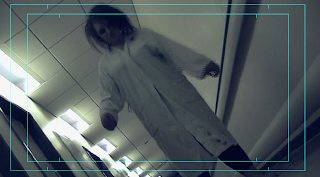
Therefore we dedicated our shot list to use as many variety of shots as we could. For example we used low and canted angle shot for when the victim (myslef) is walking down the corridor in the hospital to represent her mind being imprisoned and haunted by the demon like girl.
We also used an extreme close up when I fell to floor and started to choke. This was to heighten the unnerving essence of the opening and to emphasise the mental trauma of the victim. Extreme close ups are usually used to exaggerate someones fear in the scene, this is why we used it to focus on the
victims eyes to represent her vulnerablilty as they are wide eyed and looking straight into the camera which makes the spectator feel like the character is almost reaching out for their help, provoking sympathy from them also.
Another interesting shot was at the end when we used a high angle shot of the victim rocking forward and backward agaisnt the hospital wall, this highlights the disturbing atmosphere and connotes that she is chllenging the stereotype of a typical ‘zombie demon’ and instead is portrayed as innocent and naiive like a typical ‘victim’. 
Saturday, 30 April 2011
How did you attract/ address your audience? What techniques have you used to define genre and grab the attention of your audience in your opening sequence. Comment on the protagonist(s) and how they relate to the audience. Be specific, refer to specific shots and explain how you have used camerawork, sound (including music), mise en scene and editing to create effects and directly address your target audience.
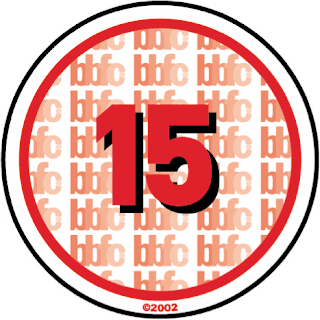
We feel our target audience is quite widespread. Because it is a supernatural horror, it could be suggested it is not suitable for children under the age of 15 years. We feel the main target audience would be the 16-25 age group, because any one older may see our film as "just another horror movie", seeing it as fake and not using their imagination. However we are also aware this is not the case with all older/middle-aged adults, as there are a lot who let their imagination run wild and this would force them to enjoy our film even more.
We have used the make up and moan and groan of the possessed Nikki-Leigh to try and relate our film to The Ring or The Grudge. The mise-en-scene of the white gown, and dirty face and feet proves Nikki is a demon, and aims to try and unsteady the audience. On Final Cut Pro we used a light tint on Nikki-Leigh’s shots that suggests to the audience the power and spirit of her is having an effect on the actual building! This is a common effect in horror movies.


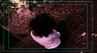
When we flashed back to Aphra in the forest, we edited the shots, adding a red tint which made the shade on the scene darker. We chose red because we feel it connotes the danger we intended to portray from Aphra's character. One particular shot we liked was when the camera was on the floor, and Nikki stumbled to the ground, coming face to face with the camera, choking. This particular shot is one of the more scary shots, and meets our target audience as teenagers often look for the more frightening shots to talk about after they have seen the film.
The voiceover we used for all our shots would have been useful for our older audience, such as the young adults, up to about the age of 30. The voiceover stops the scene from being confusing too, adults will notice this and be fond of it.
Tuesday, 19 April 2011
Thoughts/Features 10: Storyboard
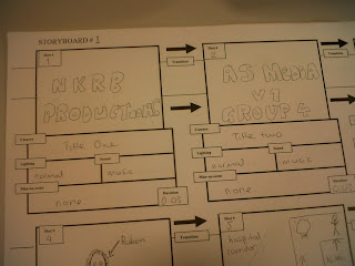
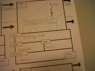
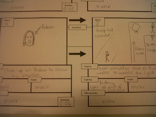
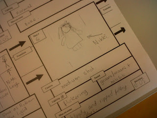
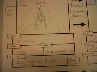
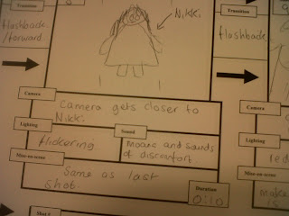
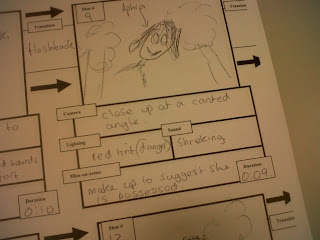
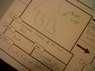 These are the pictures of our storyboard. We made a lot of changes as you can tell from comparing the storyboard, which shows our very early plans, to our finished piece. The main idea of switching between Nikki and Aphra is seen in our storyboard and in our finished piece, showing we kept our main idea all the way through. it is clear that the main idea is there in our storyboard, although it is very vague, unclear and slightly rushed. However this is the best way we can use our storuboard to add any finishing touches and we felt we did this quite well.
 Thursday, 14 April 2011
What have you learnt about technologies from the process of constructing this product?
As a group we have learnt the representations discovered through different techniques of using a camera can multiply the unsettling theme that a supernatural horror adopts to disturb the audience.
First of all, we discovered that using an unusual camera angle worked effectively when shooting the demon like aggressor as it symbolised her disturbing actions and mannerisms, such as the slow rocking or the alarming cackle. Therefore we used a canted angle for each of her shots and used mainly close ups to emphasise the possessed image and to show the audience that she is the dominant 'creature'. This worked together very successfully to create an unnerving atmosphere that not only relates to the genre but exaggerated the zombie/possessed like theme.
To further exaggerate these combinations we decided,in the editing process, to see if we could add any effects that would demonise the character even more and to create effective special effects that would make the opening more tense. We wanted to achieve this using final cut pro, where we edited all of the project, so we experimented with different techniques. To get these we used filters and motions that were placed on top of the clip in effects. At first we decided that the colour in shots of Aphra (the aggressor) would be emphasised and heightened , and the shots of myself (the victim in the hospital) would be black and white. After we tried out both of these ideas, we decided that it would look better if we used a red filter on Aphra with an earthquake motion that make the shot shake. We also created a sound on garage band using the atomic sounds to exaggerate the earthquake effect and make the spectator feel anxious and intimidated. Aswell as the filter and sounds we also made one of the close ups appear at least 3 times in vital parts of the corridor scene, this was to continuously build suspense. To add to this we also found an effect where we could create a ghost like visual technique where you could still see the shot behind. This almost made it like the aggressor is always watching over the victim tormenting her mind (this inspired us to pick the name of our production company).  These effects allowed us to create the unsettling character of the demon like girl that exaggerated our horror genre and also gave the opening an original essence. We have learnt that modern technology can create an authentic opening in many different ways offering various techniques for every genre to complement themes and messages portrayed through precise camerawork.
To create our titles we used the options available in the titling effects and again experimented with different ones until we found the most suitable one. We chose 3D titles where the text was shadowed, we thought this was most appropriate as our production company is called 'Shadow Productions'. We dissolved the titles in and out to make it look professional, the shadow on the credits and the title created mystery and suspense.

We also fused another piece of technology in our film to create music using garage band. This taught our group how to create music without an instrument but on a computer. We used this to our advantage and created the whole score using the organ pianos and also used this to create our sound effects using the atom sounds. This allowed us to create more originality in the piece and were all able to learn how to create an effective but mystery score. We had to open different sections for each instrument, this made us see each layer of the song and allowed us to pay attention to every single detail.
Using technology to edit our film has been an inspiring learning curve for all of our group where we have all excelled in different parts. Being on the other side of the camera, filming it, has taught us all the thing one simple camera movement or angle can represent or symbolise. All of this has allowed us to put so much detail in our opening to create a piece unsettling enough and acceptable for a supernatural horror.

