Welcome to Group 4's offical blog - all the work of Nikki-Leigh, Kiera, Ruben & Billy :)
Thursday, 5 May 2011
Tuesday, 3 May 2011
Picture of us all using Final Cut Pro in the media suite, a program which became extremeley useful indeed!
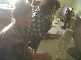
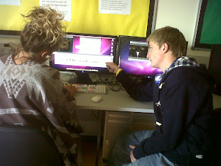
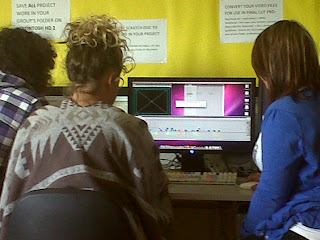
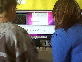
Final Cut Pro was obviously the most useful programme of all. We all had a good go at using it and despite early confusion we became good at it.
As a group, when we filmed we literally went to the wood and continued the filming in the hospital. We shot our scenes, with a variety of camerashots and angles in mind but were not certain. We wanted to create certain effects in most cases, without little knowledge of Final Cut Pro ,we often thought "oh we will edit it later". Nevertheless, it has to be said we got a bit lucky, in that Final Cut Pro was unbeleivably good, it has everything we needed, and there was nothing we couldnt do, we relied on it and it delivered, so did we, which we were all very pleased about.
7. Looking back at the preliminary task, what do you think you have learnt from the progression from it to the full task?
From our preliminary task we learnt the 180-degree rule where the camera has to stay on the same side throughout the whole of the duration of shots. We discovered that if we broke this rule the positioning of the shot becomes uneven and doesn’t connect with the previous shot. For example in our first shooting of our preliminary we broke the 180-degree rule when filming Kiera and Ruben talking. We shot Kiera from one side of the bench and Ruben f rom the other which made the sequence look unproffesional and messy. Therefore in our actual project we were always aware of keeping loyal to the rule in order for our film to look as proffessional as possible. This was more difficult at the beginning when you see Ruben walking down the stairs in the hospital. This was because we wanted to use a match cut ( different shots of the same action) to show him beginning to come down then cut to his feet, so the shot becomes half the time it originally was. In the final edit you don’t actually see Ruben’s feet but we still cut to a different shot so it looks cleaner and also not loose the attention of the audience. To keep to the 180-degree was more challenging at this point because we were exploring different angles and shots that were appropiate. However we did find that the shot when we were accidently went agaisnt the rule did not match and was definitelt not appropiate.
Using a match cut was also an extra skill that we achieved from the preliminary task that helped us step up in quality as too much time was taken up in the prelim filming Ruben walking through a door and overall made the sequence very boring to watch.
We researched on the internet different camera shots that would make our opening look more exciting and proffessional and we found the video below very helpful in explaning to us the use of match and jump cuts and also cutaways. This video influenced us to also use very different angles and shots for the whole duration of the opening. For exampl e in the preliminary task we did
not use a good variation of shots and angles that were made clear to the audience.
Therefore we dedicated our shot list to use as many variety of shots as we could. For example we used low and canted angle shot for when the victim (myslef) is walking down the corridor in the hospital to represent her mind being imprisoned and haunted by the demon like girl.
We also used an extreme close up when I fell to floor and started to choke. This was to heighten the unnerving essence of the opening and to emphasise the mental trauma of the victim. Extreme close ups are usually used to exaggerate someones fear in the scene, this is why we used it to focus on the
victims eyes to represent her vulnerablilty as they are wide eyed and looking straight into the camera which makes the spectator feel like the character is almost reaching out for their help, provoking sympathy from them also.
Another interesting shot was at the end when we used a high angle shot of the victim rocking forward and backward agaisnt the hospital wall, this highlights the disturbing atmosphere and connotes that she is chllenging the stereotype of a typical ‘zombie demon’ and instead is portrayed as innocent and naiive like a typical ‘victim’. 
Saturday, 30 April 2011
How did you attract/ address your audience? What techniques have you used to define genre and grab the attention of your audience in your opening sequence. Comment on the protagonist(s) and how they relate to the audience. Be specific, refer to specific shots and explain how you have used camerawork, sound (including music), mise en scene and editing to create effects and directly address your target audience.
We feel our target audience is quite widespread. Because it is a supernatural horror, it could be suggested it is not suitable for children under the age of 15 years. We feel the main target audience would be the 16-25 age group, because any one older may see our film as "just another horror movie", seeing it as fake and not using their imagination. However we are also aware this is not the case with all older/middle-aged adults, as there are a lot who let their imagination run wild and this would force them to enjoy our film even more.
We have used the make up and moan and groan of the possessed Nikki-Leigh to try and relate our film to The Ring or The Grudge. The mise-en-scene of the white gown, and dirty face and feet proves Nikki is a demon, and aims to try and unsteady the audience. On Final Cut Pro we used a light tint on Nikki-Leigh’s shots that suggests to the audience the power and spirit of her is having an effect on the actual building! This is a common effect in horror movies.
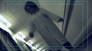


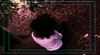
When we flashed back to Aphra in the forest, we edited the shots, adding a red tint which made the shade on the scene darker. We chose red because we feel it connotes the danger we intended to portray from Aphra's character. One particular shot we liked was when the camera was on the floor, and Nikki stumbled to the ground, coming face to face with the camera, choking. This particular shot is one of the more scary shots, and meets our target audience as teenagers often look for the more frightening shots to talk about after they have seen the film.
The voiceover we used for all our shots would have been useful for our older audience, such as the young adults, up to about the age of 30. The voiceover stops the scene from being confusing too, adults will notice this and be fond of it.
Tuesday, 19 April 2011
Thoughts/Features 10: Storyboard
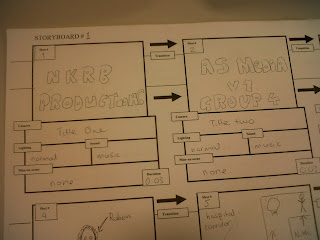
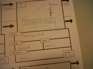
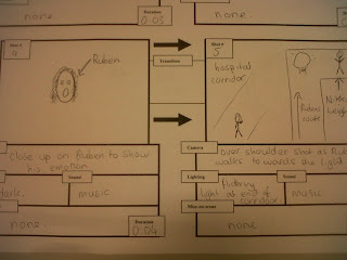
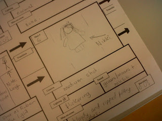
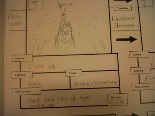
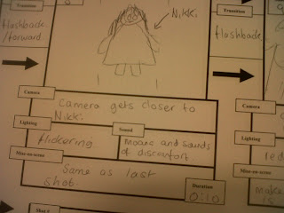
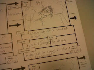
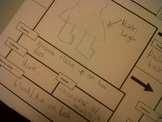 These are the pictures of our storyboard. We made a lot of changes as you can tell from comparing the storyboard, which shows our very early plans, to our finished piece. The main idea of switching between Nikki and Aphra is seen in our storyboard and in our finished piece, showing we kept our main idea all the way through. it is clear that the main idea is there in our storyboard, although it is very vague, unclear and slightly rushed. However this is the best way we can use our storuboard to add any finishing touches and we felt we did this quite well.
 Thursday, 14 April 2011
What have you learnt about technologies from the process of constructing this product?
As a group we have learnt the representations discovered through different techniques of using a camera can multiply the unsettling theme that a supernatural horror adopts to disturb the audience.
First of all, we discovered that using an unusual camera angle worked effectively when shooting the demon like aggressor as it symbolised her disturbing actions and mannerisms, such as the slow rocking or the alarming cackle. Therefore we used a canted angle for each of her shots and used mainly close ups to emphasise the possessed image and to show the audience that she is the dominant 'creature'. This worked together very successfully to create an unnerving atmosphere that not only relates to the genre but exaggerated the zombie/possessed like theme.
To further exaggerate these combinations we decided,in the editing process, to see if we could add any effects that would demonise the character even more and to create effective special effects that would make the opening more tense. We wanted to achieve this using final cut pro, where we edited all of the project, so we experimented with different techniques. To get these we used filters and motions that were placed on top of the clip in effects. At first we decided that the colour in shots of Aphra (the aggressor) would be emphasised and heightened , and the shots of myself (the victim in the hospital) would be black and white. After we tried out both of these ideas, we decided that it would look better if we used a red filter on Aphra with an earthquake motion that make the shot shake. We also created a sound on garage band using the atomic sounds to exaggerate the earthquake effect and make the spectator feel anxious and intimidated. Aswell as the filter and sounds we also made one of the close ups appear at least 3 times in vital parts of the corridor scene, this was to continuously build suspense. To add to this we also found an effect where we could create a ghost like visual technique where you could still see the shot behind. This almost made it like the aggressor is always watching over the victim tormenting her mind (this inspired us to pick the name of our production company).  These effects allowed us to create the unsettling character of the demon like girl that exaggerated our horror genre and also gave the opening an original essence. We have learnt that modern technology can create an authentic opening in many different ways offering various techniques for every genre to complement themes and messages portrayed through precise camerawork.
To create our titles we used the options available in the titling effects and again experimented with different ones until we found the most suitable one. We chose 3D titles where the text was shadowed, we thought this was most appropriate as our production company is called 'Shadow Productions'. We dissolved the titles in and out to make it look professional, the shadow on the credits and the title created mystery and suspense.

We also fused another piece of technology in our film to create music using garage band. This taught our group how to create music without an instrument but on a computer. We used this to our advantage and created the whole score using the organ pianos and also used this to create our sound effects using the atom sounds. This allowed us to create more originality in the piece and were all able to learn how to create an effective but mystery score. We had to open different sections for each instrument, this made us see each layer of the song and allowed us to pay attention to every single detail.
Using technology to edit our film has been an inspiring learning curve for all of our group where we have all excelled in different parts. Being on the other side of the camera, filming it, has taught us all the thing one simple camera movement or angle can represent or symbolise. All of this has allowed us to put so much detail in our opening to create a piece unsettling enough and acceptable for a supernatural horror.
What kind of media institution would distribute your media product and why?
Our film was based around a supernatural horror idea, very similar to “The Ring” (2002). The Ring was produced and distributed by DreamWorks, however other companies such as MacDonald/Parkes Productions who also helped with distribution.
Our film could also be compared to “The Grudge” (2004). This film was not as successful as The Ring but was still widely popular across the world. Columbia Pictures
produced and distributed The Grudge, with help
from Ghost House Pictures and Fellah Pictures.
There are several independent British film companies that would distribute films such as ours. One example is Coffee Films, who have done films such as “Last of the Scottish Wildcats”. Coffee Films have completed a wide range of films over the years, experimenting with technique, style, genre and the medium of moving images generally. The films vary from the classic 5-minute black and white short to hour-long wildlife documentary.
Another example of a company that may distribute such a film as ours is Bushy Creek Films. This
is another low budget, independent British company, based in the West Midlands, making feature and short films. Their aim is to develop talent both in front and behind the camera and during that process make good quality British Films with budgets of £2M or less. Since forming in 2005 they have established good working relationships with majo
r studios, distributors, sales ag
ents, financiers, postproduction houses and executive produce
rs. Their first feature film Gridiron UK is scheduled to be filmed in June 2011 and have a major cinema release early 2012 with worldwide DVD release backed by a major studio.
Places we could market such a film such as ours are places such as filminthefridge.com and New Market Films. Its hard to raise awareness with no existing popularity, so social networking sites such as Facebook can be used to gain popularity and post trailers, and then furthermore, post links to sites where our film can be streamed for fee’s and memberships ect. This would be the most suitable marketing campaign for our film as our target audience are the social netw
orking era making viral marketing the best option. This girls profile would be one of our possible target audience. We would also make a twitter account and encourage groups of teenagers and young adults age ranged form 15-25 to follow not only the film but us personally so the audience can see the process of the film more personally. Another reason viral marketing would be more appropiate is because the reality
of the budget, a budget of 10 thousand pounds would you give you 6 slots in ITV or 50 shots on Sky One during the daytime. However this would be the wrong time to capture our target audience as we would aim to have our advert appear after comedy shows such as 'Never Mind the Buzzcocks' or 'Celebrity Juice'. This is because
these are the shows that are more likely to be watched by teenagers and young adults. So
, because we would be an independent production and distribution company our budget would not reach out for a TV advert, therefore we would make a website devoted entirely for our film. Hollywood Blockbusters, such as the Dark Knight, had very successful viral marketing campaigns by capturing their audiences attention by making them solve mysteries about the Joker by playing games and following clues. This would also appeal to our film and would encourage our audience to watch the film in the cinema. We would make an online game that would relate to our narrtive.
It would be best to market our film on the European film market because going worldwide would be very difficult at such an early stage. The ideal place would be the “New Media Film Festival” or film festivals that are dedicated to independent films such as 'Cannes Film Festival' where new films and their producers go and exhibit films, selling material and making money. We would also set out to sell our film to a distribution company that would distribute our film all over Europe. This would be our best option by far.
In what ways does your media product use, develop or challenge forms and conventions of real media products?
The broad genre of our media product is horror, however it tackles the conventions of the subgenre supernatural horror/zombie. The typical conventions of a supernatural horror can consist of characters being ‘possessed’ and ‘haunted’, for e
Even though the role of the woman has been challenged from the expected, supernatural films have adopted this method so it has now become the norm of the sub-genre. We have dedicated our film to this particular convention to complement the supernatural/zombie theme. However, most films of this genre still refer to a male or a demon as the dominator of the narrative, for example the ‘The Exorcism’ is dominated by a demon believed to come from the devil and in ‘Paranormal Activity’ the woman is haunted by a demon from her childhood. We took these aspects into consideration but decided we wanted to come up with something a lot more original for our production so we were able to create our own sense of disturbance and challenge the conventions. The way we did this was also use a woman as the dominator, the ‘demon’. She would be the person in the narrative that would had possessed the girl from the opening. This goes against the typical conventions and allowed us to explore different methods to portray the possessor as unsettling and daunting. We succeeded this through firstly the camerawork filming her at a low angle with some shots to represent her with the higher status but also we directed Aphra to come close to the camera. This almost manipulates the camera and makes the audience feel like they are being watched over as her eyes gradually become wider which emphasises the claustrophobic feel to the opening. We also used a red filter on the shots of Aphra to foreshadow to the audience that she is the ‘demon’ in the narrative. After we had used this red filter we realised that it looked like it had drowned the shot with the colour red, which we thought, could connote the demon woman’s thirst for danger and possessiveness. To further this image o f the demon like woman, we created a look through black eyes using make up and back combing hair to represent her craziness, however this was not just used on Aphra’s character but also myself, Nikki-Leigh, as the victim to show her ‘new’ adopted possessiveness. We based the make up on ‘The Grudge’ and aimed to create a chilling effect.
The mise-en-scene of the film aimed to create an overall unsettling atmosphere for the character. We did this using two locations, the first for the demon like woman Longford Park where we used the bushes to exaggerate her unexpected eerie behavior, and the second, Withington Community Hospital. The hospital is also a common convention of a horror film, which can leave the audience feeling closed in and intimidated. We wanted this to symbolise the imprisonment of the victims body trapped by the demon like woman, the hospital corridor can see
How does your media product represent particular social groups?
The actors in our piece were all in the age group of 16-18, showing they are still teenagers, and our opening represented them as the typical “troubled teenagers”. Nikki-Leigh Rogers is the main character in our piece, she has been possessed and her actions portray this with her stumbling and moaning/groaning. She is presented as troubled, as so many teenagers are, even more so in females, it is a typical stereotype that we feel our piece fits.
Nikki-Leigh, a 17-year-old girl who has been “demonized”, also matches the stereotype that females are always the victims; the voiceover included adds a dramatic feel. The tone Nikki possesses in the voiceover seems to portray the typical “damsel in distress” which women are always stereotyped into. However, the same cannot be said for our killer/psychopath in our film, Aphra Evans. Aphra is the same age as Nikki, but instead of being presented as the victim, she seems to counter stereotype females of this age because she is the killer.
Nonetheless, it could also be said that Aphra has become such a “troubled teenager” to the extent where she has turned to crime and making others unhappy, by killing and demonizing others, but this is left to the imagination of the audience.
The final actor included in our piece was Ruben Milner. Ruben is the only male in our piece and his involvement is as a visitor at the hospital for his acquaintance Nikki-Leigh. Ruben’s involvement is just walking so it is hard to see what stereotypes he might fit. However, his slow movement, leading up to the introduction of Nikki portrays him as the typical lazy 17-year-old male, presented with a blasé attitude.
Questionnaire
(circle your answer)
1. Which category of age do you fit into?
10-13/ 14-16 / 17-20 / 21-25 / 26+
2. Gender
Male/Female
3. Do you watch horror films
Yes/No
If yes, how often do you watch horror films?
Daily/Weekly/Monthly/Annually/Other
4. Do you like horror trailer to leave you in suspense?
Yes/No
Explain why?
5. What is your favorite sub genre of horror.
Supernatural/Zombie/Thriller/Psychological/Vampire/Other
Explain why?
6. What sort of things do you expect to see when you watch a horror film?
Tuesday, 5 April 2011
Sound:
Firstly, this wasn't planned but we decided to add a voice over to our film opening. When we got the outside perspective of our work it was noted that our piece may come across as confusing because we know whats going on, but the audience do not know the storyline. In the end we decided it was best for us if Nikki Leigh did the voice over as it suited her character. She went on to explain the story giving the people watching a better idea of whats going on.
However, this wasn't all we did for our sound. We have been onto Garage Band and created a soundtrack to go underneath the voice over for an extra effect. Admittedly its nothing too complex, a few solemn notes and dark and eerie sounds, but when Nikki stops talking it really does have the desired effect, connoting a psychological threat and mysterious feel to each shot.

Thoughts/features 8:
Lighting/Tints:
The lighting in our piece was vital due to our genre. We had to find a tint which resembled that of a horror and psychological genre.
In order to achieve this we added a white tint onto the shots of Nikki Leigh in the corridor. The existing colours of a green feel complimented this to give a surreal shade on the shots. It created the effect which suggested the end, when people are said to "walk in
 to the light", and we felt this kind of effect would help to add the mystery and creepiness we aimed for.
As well as this, on the shots of Aphra in the forest, we added a red tint, of a dark calibre. The reason for this was because Aphra was a killer, therefore we felt red indicated danger, darkness and murder and it also gave a sense of mystery to the opening which complemented the supernatural sub-genre of horror.
The light tone we used for Nikki Leigh we also used for Ruben in order to get good balance of contrasts across the whole scene. We feel this worked best.
Tuesday, 29 March 2011

Thoughts/Features 7:
Throughout the opening, we filmed in Withington hospital mainly because we was relating back to the horrific genre of our piece. The hospital creates a cold and deserted atmosphere, and as many people dislike visiting the hospital in most cases we thought our film would create more of a nervous and suspension building feel. Continuously in our film, we have used flashbacks to gradually build up the nervous excitement for the audience. We have edited the flashbacks to a faded washed away red, connoting the danger, which then makes the audience feel nervous. It also suggests the evil and horror of the film. We have slightly changed the filter when focusing on to the chacater in the hospital to a faded dirty grey tint. The cloudy grey suggests the darkness of entrapment surrounding the girl which realates back to the flashbacks of the killer. Contracting with this the light whitness of the filter indicates the innocence and neglected freedom from the girl. It also shows the confusion and her cloudy memory as to why she is in that position.


Thursday, 24 March 2011
The make up we chose to use in our film best suited a horror/thriller genre and added to the unsettling essence. For the girl in between the shots of the demented girl in the hospital, we chose to use a blue and grey eye shadow that emphasised the widening of her eyes and gave them a deadening dark look. The reason we did this is because the makeup not only added to the archetype of a ‘possessed’ girl but it also gave it an almost hypnotic stare, which could startle the audience. The crazy backcombed hair complemented the extreme physical look. The girl the audience see’s in the bushes plays an important role not only in the narrative but also in the mental illness of the girl seen in the hospital. We decided to include her in the opening so it gives the sequence that unnerving effect that will helpfully disturb the audience. This is why we had her looking more possessed than the girl in the hospital because she is the whole reason she is there, we emphasized this through the use of the diegetic humming and the predator expression.
The use of costume and makeup for the possessed girl in the hospital also needed to fit in with the genre and use the typical conventions. However, we did not use a typical hospital gown as it would be too obvious for our piece and did not want her character as a drop in hospital patient. Therefore, we used an old washed out dressing gown to connote that she has been there for a long period if time, multiplying the disturbing theme. For her makeup we used the effect of her crying by smearing mascara down her face, however it does not only create the effect of crying it also suggests distressing behavior. This emphasises
the zombie like walking, which encourages the audience’s imagination to wander, and question why she is like that. 
Thursday, 17 March 2011

Thoughts/Features: 5
We have finished our production process at our main location, Withington Community Hospital. Out of the two dates we completed the filming on the first date (15th March) as we were organised and the hospital were very helpful as they let us film in a corridor where there would be no interruptions as the appointments had all finished. They offered us various corridors upstairs and downstairs to which one would be best suited to our film genre. We explored the corridors availabl e and practiced some of our shots and different angles, this was a great advantage as it allowed us to see which part of the hospital complimented not only our various camera shots but also the narrative and genre. In the end, we decided to shoot Ruben coming down the stairs of the hospital as it gave us the chance to use match cuts and aerial shot in an unusual angle. This connected to the atmosphere of the opening as it gave a sense of mystery.
The corridor we chose looked more effective as it was long and narrow with a large window at the end, which gave it an effect of the corridor closing in on the possessed girl.
Our choice of a hospital location worked very effectively and also gave us as directors, cameramen and editors, an essence of the feel of a horror/thriller genre and encouraged our ideas and improved them by expanding them deeper.
We are very thankful to Withington Hospital for their kindness and will be writing a letter to show our appreciation.
Thursday, 3 March 2011
This is a shot list for our Main Task, The Reprobate, which is about a girl who becomes possessed by demons.
Shot 1. Medium shot of Nikki Leigh walking into the hospital.
Shot 2. Close up on Nikki Leigh as she enters the hospital and looks down the corridor.
Shot 3. Over the shoulder shot of Nikki Leigh, as she slowly walks down the corridor towards a flashing light.
Shot 4. Long shot of Kiera as she slowly walks down the corridor with the flashing light. However she gets closer meaning it eventually becomes a medium shot and even a close up.
Shot 5. Close ups of Aphra as the shots cut from her and back to Kiera.
Shot 6. Low angle shot of Kiera as she walks down the corridor.
Shot 7. Shot reverse shot of Nikki Leigh and Kiera in the corridor.
Shot 8. Extreme close up of Kiera’s feet.
Shot 9. High angle shot of Aphra on more than one occasion.
To be continued..?
Thoughts/Features 4:
Analysis of the opening ‘The Exorcism Of Emily Rose’.
The opening of The Exorcism of Emily Rose aims to unsettle the audience immediately and create suspense as a mysterious score surrounds the focus and attention. The titling appears by fading in and out creating, already a sense of mystery to the narrative (which is a key feature to a thriller/horror film). This is further exaggerated through the real recording of the girl Annelise Michel, who this film is based on. It is amplified into an echo to emphasise the disturbing effect on the spectator, not only through the unnerving and possessive sound but also the fact that no picture appears on the screen so it is left to your own imagination. Instead, writing in a blocked gothic font reading “This film is based on a true story” emerges and alarms the audience and expands the mystery essen ce. The non-diegetic sound effect is of the girl doing a devilish scream and almost growling creating a sense of a creature, which encourages an automatic response for the audience making them feel unnerved and distressed.
As a white screen fades in a medium shot of a barbed wire fence the title of the film appears. The single white screen connotes innocence and purity, which could foreshadow an unfortunate event to a vulnerable character. However it is then manipulated by the deep red colour of the title that suggests blood and danger.
As the title fades away there is a low angle wide shot of fields rustling in the wind. The diegetic sound effect is exaggerated to create an essence of anticipation for the audience as it leads to a false expectation of something about to happen. As the scene cuts to an aerial shot there is an establishing shot of a old crooked house in a desolate piece of land. This is a typical convention of a horror/thriller genre film as it builds up tension.
One of the interesting elements of the shot is that it is edited in a grey filter, which creates a de-saturation of colours making everything washed out indicating a isolating theme to the film. It also develops the mystic element of the opening. The house is emphasized in faint, which looks like, a sepia tone to imply an antique value making the audience anxious. This is another typical convention of a horror film as using the effect of something worn out or ancient creates an immediate effect of anxiety and builds up adrenaline for something to happen.
Thursday, 17 February 2011
Treatment:
V1 Group 4 2011 - Billy Greenall, Nikki-Leigh Rogers, Ruben Milner-Edwards and Kiera Molloy.
The Opening of a Short Film:
The Reprobate (Horror) (2011)
Duration:
Approximately 2 Minutes
Audience:
Our opening to this short film will target the young adult group, which mainly concerns those aged 18 - 30 years old of both genders. However, the blood and gore could suggest the males would prefer this movie, but the stronger-stomached females may also enjoy this. The psychologicaly of this film means it could prove to be too horrific for the younger generation, with scenes of a distressing nature included. The cinematic effects could lead the older generation (30+) to see the film as unrealistic and silly, leaving the young adults to use their imagination and get the best values out of this film.
Resume:
A woman stumbles violently down an empty hospital corridor. The screen flashes and another woman appears in a strange and creepy fashion,the audience later find out that this woman is a killer. The plot is non-linear, and the opening is also the ending to the film. The film is about how the first woman found herself in this particular state - she became possessed by a demon. The killer is the one who murdered the now-demon woman, and the story is about how this happened and the events which unfold.
Suggested Elements:
Performance: Woman stumbling down hospital corridor with lights flashing. Another woman looking odd, sick and possessed in the darkness.
Costumes: Both women will be in freaky and theatrical outfits. The woman in the hospital should be in garments typical of a hospital, while the killer must dress in clothes which a killer would dress in, looking dark and not at all revealing.
Props:
Key Locations: Withington General Hospital.
Title/Opening Credits: Flashing and fading into the opening sequence in the hospital.
Recording Days:
Tuesday 15th March 2011 (Production)
Thursday 17th March 2011 (Production)
Tuesday 22nd 29th March 2011 (Post Production)
Thursday 5th April - 29th April 2011 (Editing)
These are only approximate dates.
Treatment:
V1 Group 4 2011 - Billy Greenall, Nikki-Leigh Rogers, Ruben Milner-Edwards and Kiera Molloy.
The Opening of a Short Film:
Title: The Reprobate
Genre: Horror
Duration: Approximately 2 minutes
Audience:
Our film will target the young adult age group, mainly 18 years to 30 years old of both genders. However, the blood and gore could lean the film to be more suited to males, but there are also females who like such thrillers. It would not be suitable for younger children as it is quite psychological, and children often have nightmares. The majority of the more older generation would probably not enjoy the film because they may be too mature to see it's true value and thrill - they may see it as silly or unrealistic which it is, but with horrors a lot is left to the imagination.
Resume:
Tuesday, 15 February 2011
We have been in negotiations with Withington Hospital and they have given us permission to use their hospital for one of our film locations. We have agreed on the time for after 4 o'clock since this is the quietest time in the hospital. This allows us to film and not disturb any hospital routines. We really appreciate this opportunity as it will help us to try and achieve higher grades.
These are the emails from Jan Owen the assistant manager of the fundraising and donations department at Withington and Wythenshawe Hospital.
This is the response from my first email previously posted on the Blog:
Hello Nikki
Thank you for providing detailed information on your project. I hope to be able to accommodate you but need to gain permission from the Hospital Manager at Withington Community Hospital who unfortunately is s not available until Monday. Therefore I will get back to you early next week.
Kind regards
Jan Owen
Mrs J P Owen
Assistant Manager, Fundraising & Donations Department
UHSM
Southmoor Road
Wythenshawe
Manchester, M23 9 LT
Tel: 0161 291 5961 Email: Jan.owen@uhsm.nhs.uk
This is the email confirming our permission:
Hello Nikki-Leigh
I am pleased to inform you that permission has been given for you to film at Withington Community Hospital.
Please confirm which day you would like to come in ideally between the 14th and 17th of March from 4pm onwards. I am only in the office today and tomorrow this week, so please try to get back to me asap so that I can make the necessary arrangements for your visit.
Regards
Jan Owen
Mrs J P Owen
Assistant Manager, Fundraising & Donations Department
UHSM
Southmoor Road
Wythenshawe
Manchester, M23 9 LT
Tel: 0161 291 5961 Email: Jan.owen@uhsm.nhs.uk


